Philosophies
Everything is a list

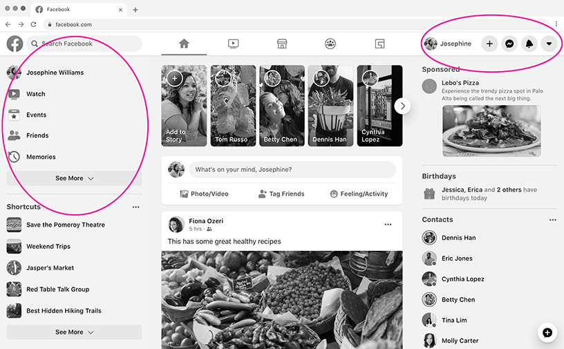
There are thousands of ways we could go about creating these. But if you think about it, everything is a list:
<crow vertical left>
  <crow>
    <svg />
    Josephine
  </crow>
  <crow>
    <svg />
    Watch
  </crow>
  <crow>
    <svg />
    Events
  </crow>
</crow>
<crow left>
  <svg />
  Josephine
  <svg />
  <svg />
  <svg />
  <svg />
</crow>
If that's not considered clean & semantic code, I don't know what is.
Isolation of concern
All to often I see something like this:
<div class="menu">
  <div class="headline">Dishes</div>
  <ul class="list">
    <li><a>Meatballs</a></li>
    <li><a>Pad thai</a></li>
    <li><a>Carbonara</a></li>
  </ul>
</div>

<style>
  .menu {
    background: lightgray;
    padding: 16px;
  }
  .headline {
    margin-bottom: 16px;
  }
  .list > li {
    margin-bottom: 8px;
  }
</style>
Notice the extra 8px margin at the bottom. This is a very common issue and
almost every website have a few of these.
In some cases, for example when listing elements horizontally, you can get away with it - because
it's not noticeable:
<div class="breadcrumb">
  <div>User</div>
  <div>/</div>
  <div>Details</div>
  <div>/</div>
  <div>Edit</div>
</div>

<style>
  .breadcrumb {
    background: lightgray;
    padding: 16px;
  }
  .breadcrumb > div {
    margin-right: 8px;
  }
</style>
Luckily if you are using a modern CSS-framework such as Tailwind they do take care of these
things for you.
However, going back to the first example you would still have the .headline push the list down by
16px by manually applying margin. So even if you are using smart utility classes (such as Tailwind's
"space-y-2") you'll still encounter situations where you feel the urge to push elements manually.
Working with crow you have nothing of that. Each element "minds its own business", if you will:
<div class="menu crow vertical left gap-4">
  Dishes
  <ul class="crow vertical left gap-2">
    <li><a>Meatballs</a></li>
    <li><a>Pad thai</a></li>
    <li><a>Carbonara</a></li>
  </ul>
</div>

<style>
  .menu {
    background: lightgray;
    padding: 16px;
  }
</style>
Working this way we get more predictable results & elements/components that will work in isolation.